By Imogen Sykes and Ethan Calder
Edited by Naomi Adam
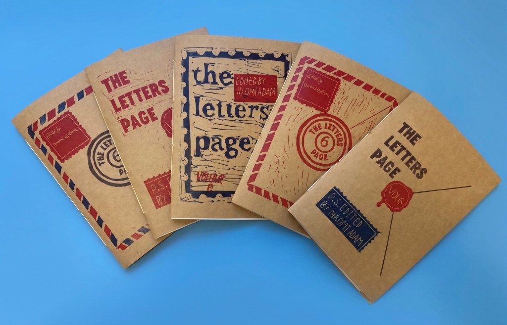
With production for the sixth volume of The Letters Page finished, we take a look back at some of the processes that have brought us this far, delving into the process behind the design and creation of the hand-printed cover art for this unique new issue.
To create the Volume 6 cover art, our team took a visit to Studio Instar, a stunning artist-led printmaking workshop in Sherwood run by Trish and Nick, who very kindly walked us through the printmaking process as we worked to assemble the final prints for the cover of our latest volume. As an art form, printmaking goes back as far as Han Dynasty China, the earliest known example dated somewhere between 206 BC and 220 AD, created from the imprint of a carved block of wood upon silk. Meanwhile, the earliest European prints go as far back as the 15th century, used in Germany to make playing cards. And six centuries later, the form took another pivotal step when it reached us at The Letters Page!
Relief printmaking, the oldest and generally most popular facet of the art form, works by transferring images carved into a material (like wood or linoleum) onto paper or a fabric. The design is carved into the template, the raised areas are then inked or painted, and the template is stamped onto the paper, leaving a relief of the image behind. The technique is praised around the world to this day for its striking results and versatility. Thankfully, it is also accessible for beginners!
The first step was the designing. We challenged ourselves to unpack the concepts at the core of the journal, building ideas that channel the tone of the volume. We looked to past issues for inspiration and motifs, from the international focus of the last journal to the technical aesthetic of our very first issue, and considered thematic stylistic flourishes, incorporating elements like stamps and seals. The creative freedom to play with ideas that intrigued us was particularly exciting. It was thrilling to imagine something that could then become real, taking on physicality and shape – the whole process was in general great fun!
Once we each had a design we were happy with, we started the tracing. This part opened up new and interesting considerations, like how the image would have to be reversed to print properly when flipped onto the paper, or how we’d get the outlines of the design onto the lino itself to trace. Under Trish’s instruction, we pencilled the inverse of our designs onto tracing paper, then onto red wax paper placed over the lino, leaving a red stencil on the block to gouge away at.
Then, with the lino marked up, it was time for the main event: the carving. This was the longest part of the process and carried our ‘morning’ workshop all the way into the afternoon.
Lino carving tools fall into two categories, each one with a range of sizes. V-shaped tools are used for precise carving, ideal for the initial outlining of a design and therefore usually the one you pick up first. Having three designs all with rather intricate lettering meant the V-tool was our best friend for getting those clean corners and smooth curves. (You might notice that two of our designs include some very fine lettering in white – these letters were carved in relief using the finest V-tool as they would be too fine to stamp out like the larger lettering). U-shaped tools come after outlining and are used for carving away large sections of relief space. After hours of very fine carving, it was a big relief (pun intended) to begin hacking away with the U-tools.
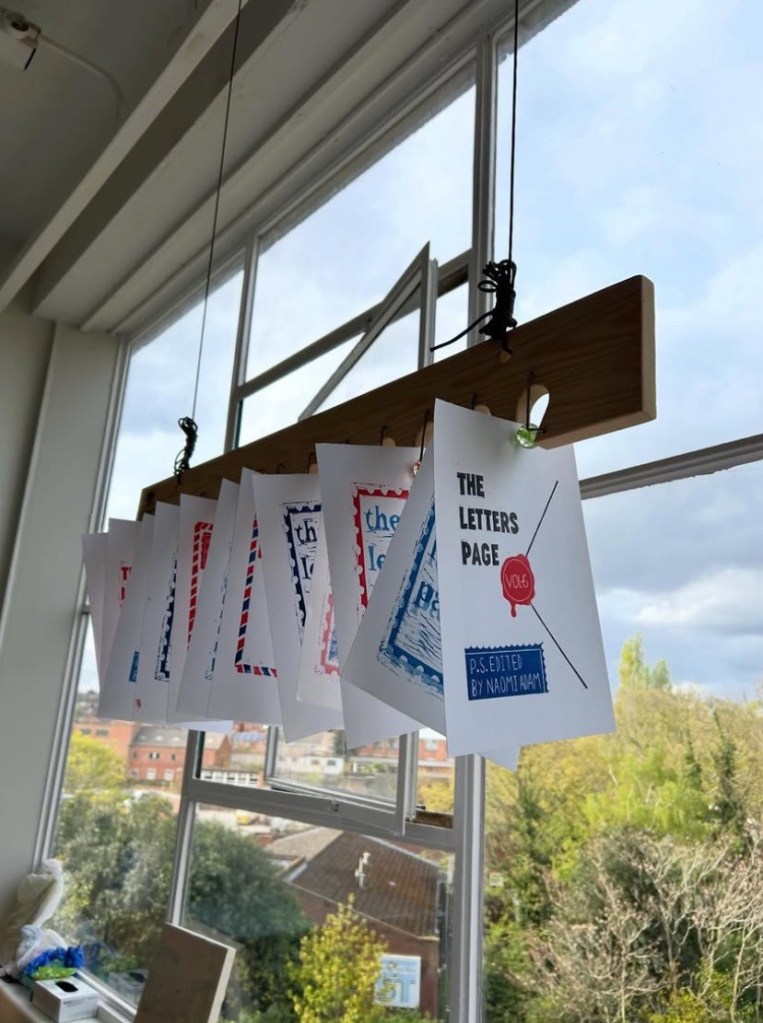
Things really took shape after carving – all that was left was choosing and applying our ink. In keeping with previous volume covers and a general mail-based colour scheme, we opted for dark blues, bright reds, and black.
When applying the ink to a stamp, it is important to get an even and thorough coating to ensure a clean print. To do this, rollers are used first to evenly swatch the ink onto a surface, before putting the roller to lino. Trish advised one-directional application for best coverage rather than rolling-back and forth, as well as doing several light coats instead of a single heavy one.
Of course, we couldn’t make things too easy for ourselves and were keen to print some designs with multiple colours. Trish proposed two methods: the first was rolling different ink colours all onto the same piece of lino – which proved tricky for avoiding accidental ink mixing; the second was to create separate little lino stamps which were then pressed on top of the printed base design. The challenge here was ensuring accurate placement. Luckily, both methods proved successful.
Finally, we were over to the printing press! With our lino inked up, we carefully placed it on the printing press, laid down the printing paper, and rolled it through. And then… repeat!
Lino printing has been favoured as a highly versatile, accessible form of printmaking since its rise in the early 20th century and is still widely used today thanks to studios like Instar. If you are interested to see which designs made the final cut (again, pun very much intended), . take a look across our social media accounts, or perhaps even order your own lucky dip copy – available now here, while stocks last!
The Letters Page will be closed for submissions until late 2027, and won’t be in the office. But if you write to us your letters will certainly be kept safe and find their way to us eventually. It would, as always, be great to hear from you.
The Letters Page, School of English, University of Nottingham, NG7 2RD, UK
See our submissions page for more information
